


OVERSIZED ALPHABET SERIES
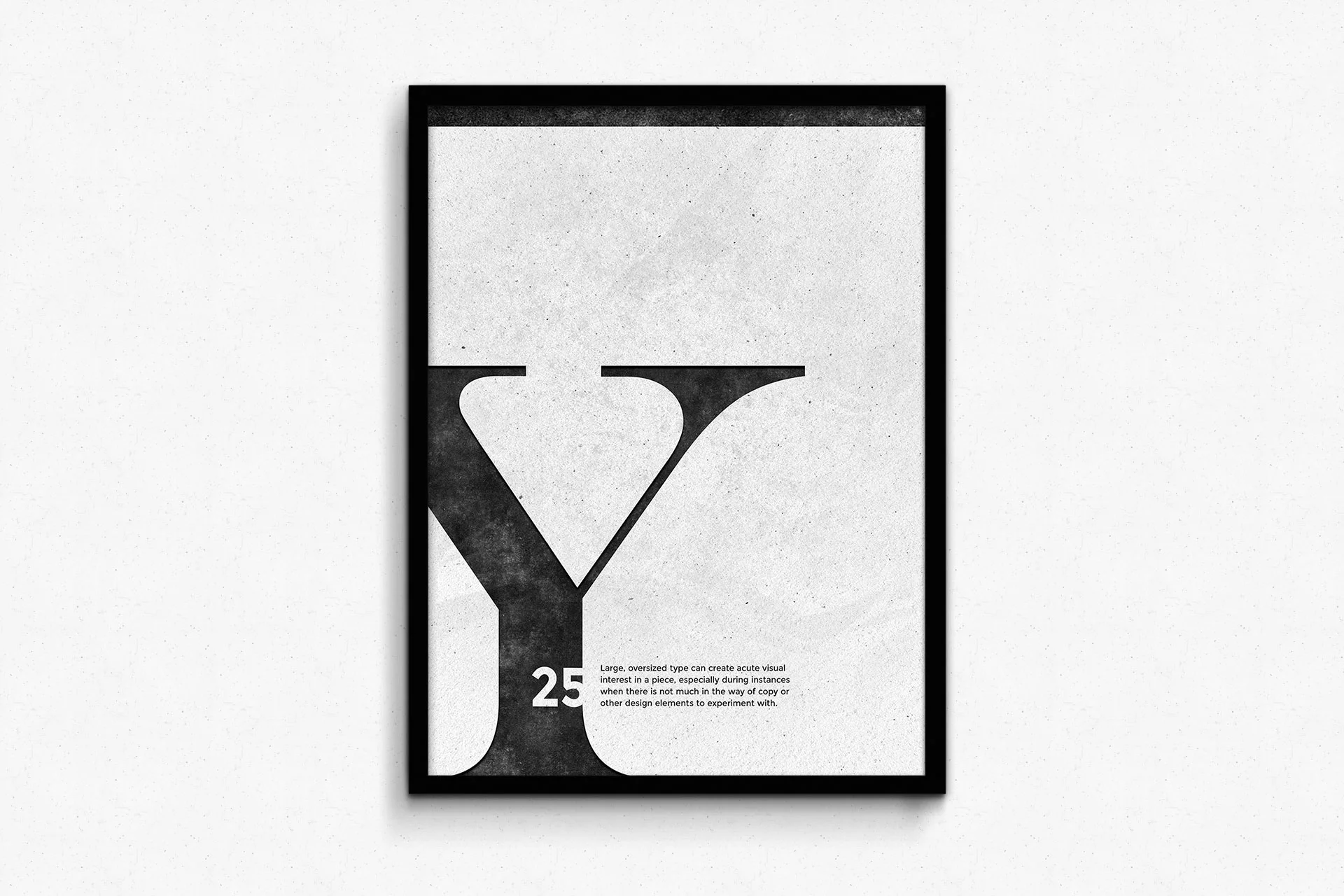
The entire basis/idea behind this project was to experiment with typography as the main focus of an entire poster series. This led to the idea of using oversized letters as design elements in order to grab interest in a unique way.
These posters would probably function best while framed and hung somewhere viewable and able to be read while standing. Such settings for example, could include classrooms, offices, or museums (maybe an art or design museum?).
As I progressed through this poster series, I found it increasingly difficult to arrange the large letters in new or unique ways, different from ones I had done earlier on in the project. To remedy this issue, I began changing it up a bit. Whereas early on in the project, I limited myself to one paragraph of body copy, I began giving myself, two, three, even four paragraphs of text to play with. The more elements I introduced, the easier it became to arrange fresh layouts and as an ultimate result, change the effectiveness/application of the design. I even started to deviate from the strip of black I included in most poster variants, removing them in versions where the layout called for it.
This has definitely been a fun personal project, and I may continue to add onto it!